Skip to content

VDRSN

Dan Vidrasan

Digital product designer.

    • About
    • Homepage
  • Researched and designed a product to change how the renting process works in the United Kingdom


    We’ve designed and developed a product enabling renters to generate a digital “renter passport” consolidating all necessary rental information. This allowed them to easily share it with estate agents, fostering transparency and decreasing the time that it takes to rent a property.

    Company

    Rightmove

    Space

    Proptech

    Period

    2017

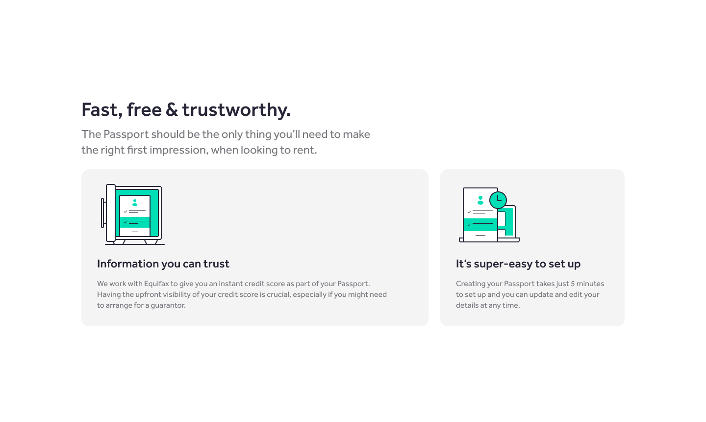
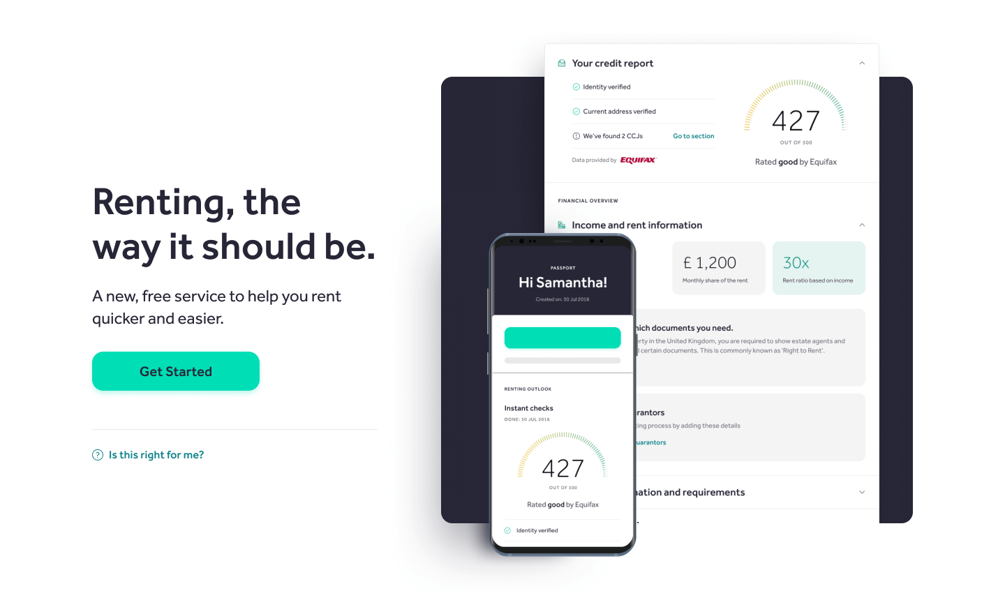
    Hero section of the passport homepage.

    Objectives

    The objectives were to streamline the renting process and reduce the time that it takes to rent a property, by simplifying the journey for renters and offering estate agents information up-front at the same time diversifying the product offering and revenue streams.

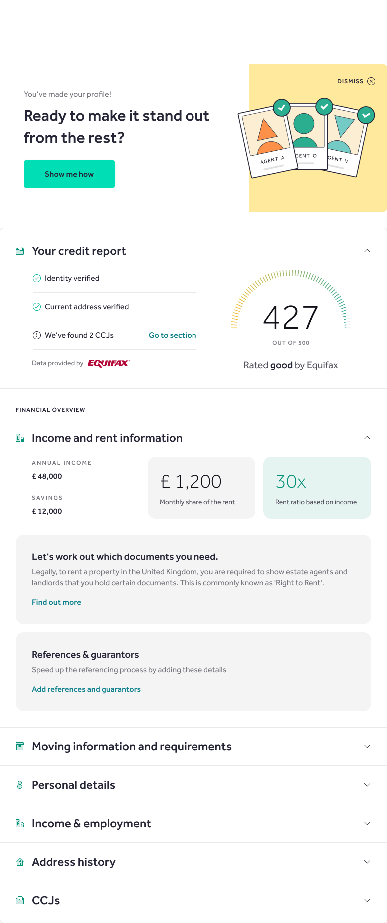
    Preview of the passport, once created.

    Messaging section on the homepage.

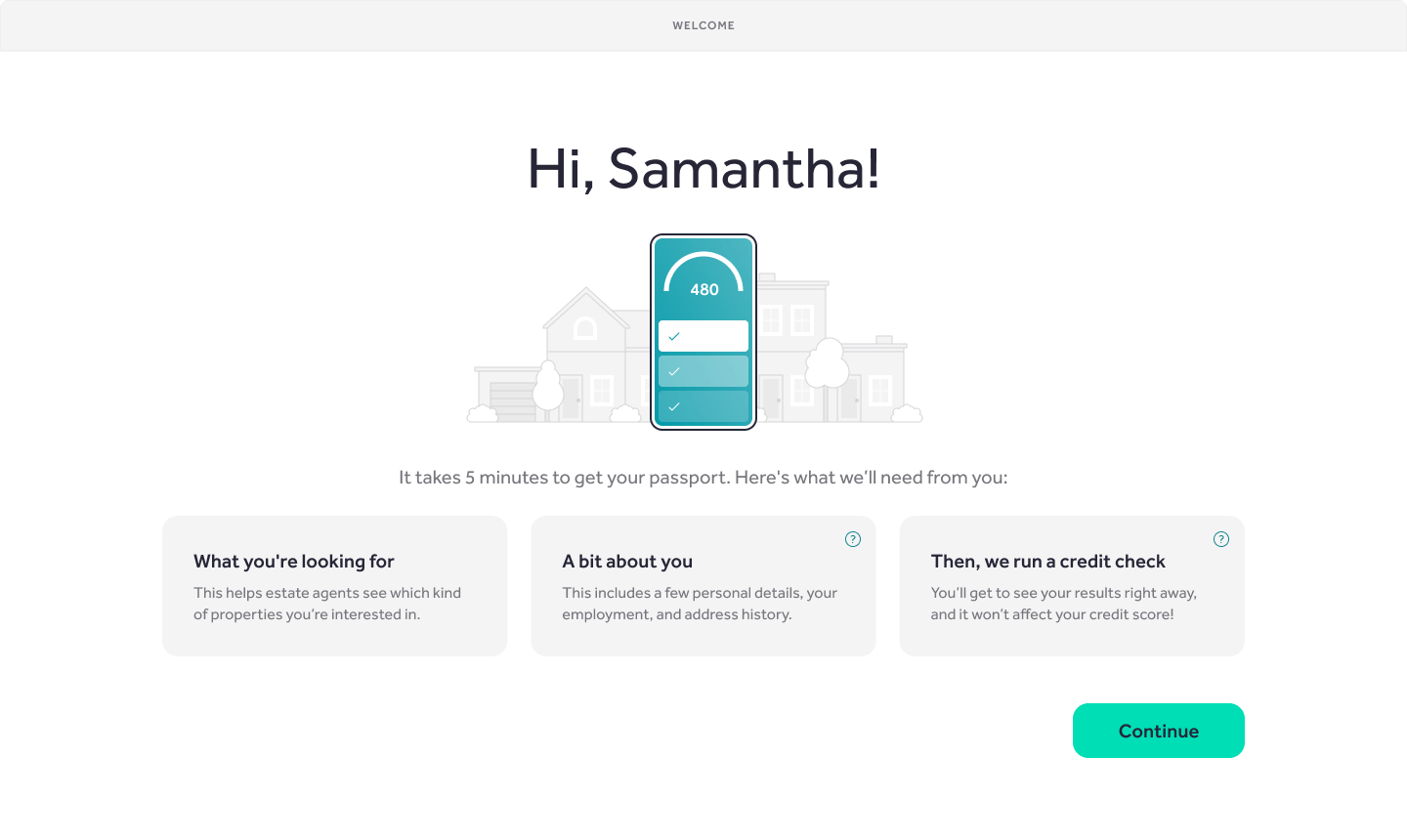
    Initial screen when starting to create the passport.

    Outcome

    Around 7,000 tenants create a passport at launch and rented using it. The findings from this informed improvements to the Rightmove user profiles and also the creation of new products like the Viewings Manager, that had 18,000 passports completed in Jan 2021.

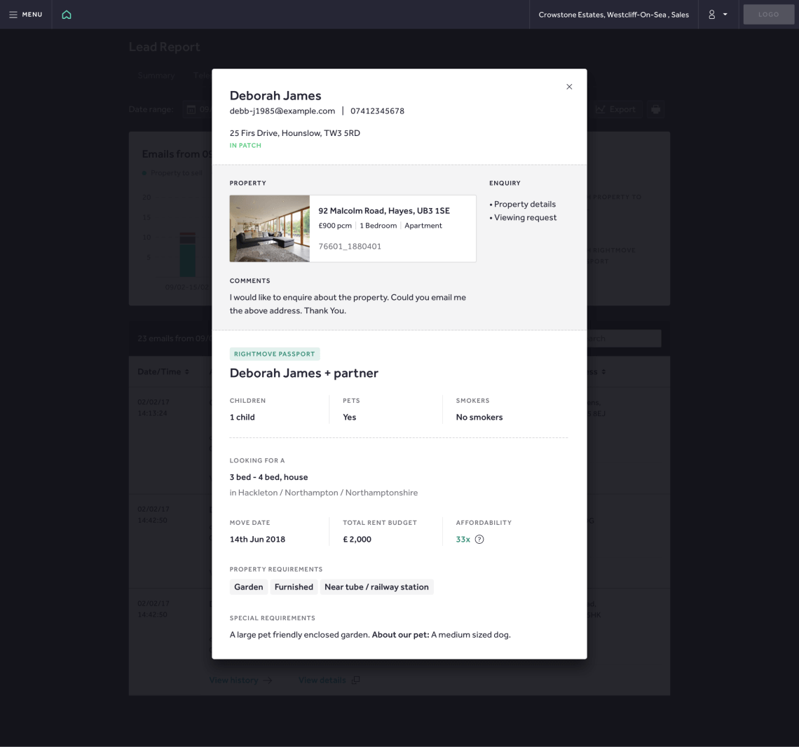
    Preview of the passport for the estate agents.

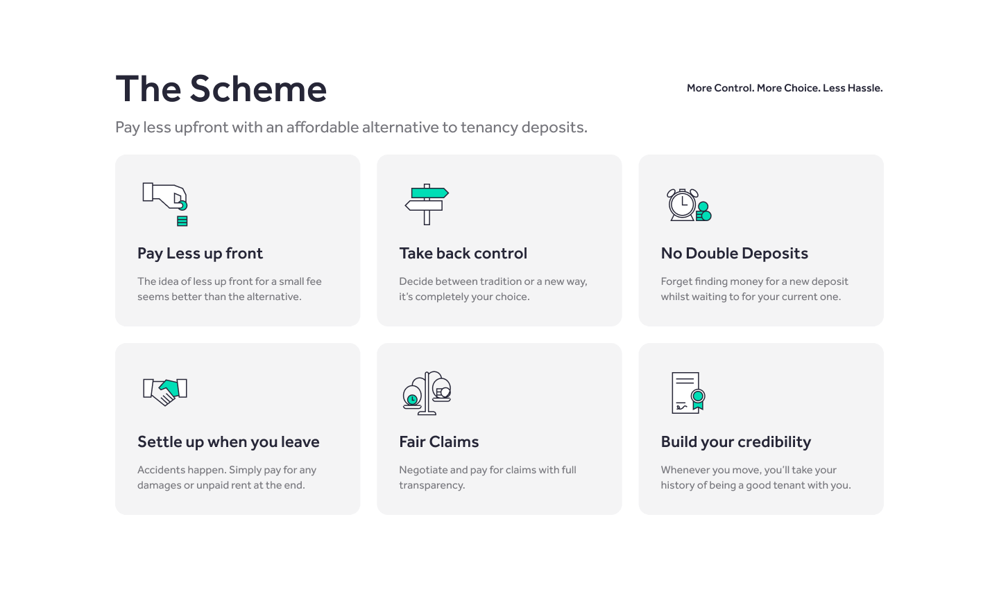
    Messaging section relating some of the features.

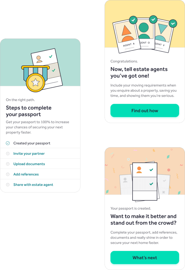
    Examples of some of the next steps after the passport is created.

    dan.vidrasan@gmail.com

    April 21, 2024
    Case study
    Research, UI/UX DESIGN, User testing
  • Improving the lead generation forms and implementing a healthy design process

    I’ve designed a lead generation form that enabled customers to apply for equipment finance and working capital loans. The client, a leading provider of finance solutions for small and medium businesses in the United States, aimed to transform their lead generation form into a product for themselves and their partners. The form had to support various levels of customisation.

    Company

    NDA

    Space

    Fintech

    Period

    2021

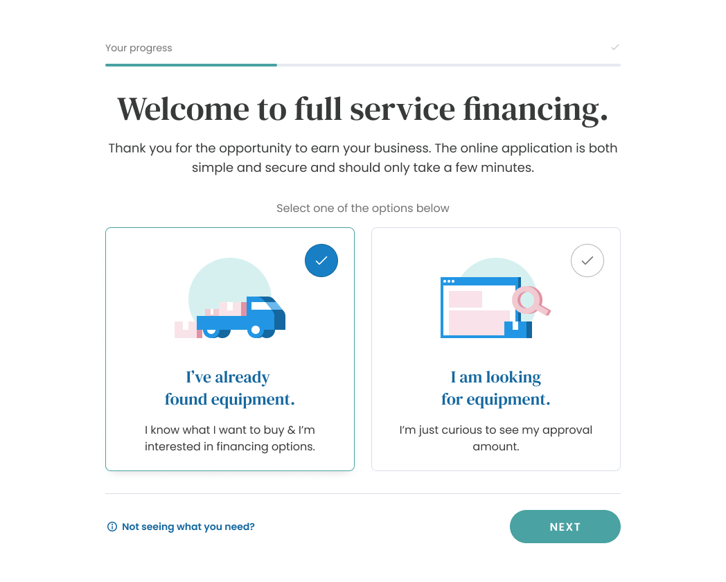
    The initial screen of the customer form.

    Objectives & Challenges

    The goals here were to improve the customer experience, generate higher quality leads and increase the conversion rate. The form had to support theming and various levels of customisation in terms of completion patterns and amount of information gathered.

    Some of the challenges were:

    • steering conversations from the visual aspect to the business goals and improvement of the overall customer experience
    • ensuring that we eliminate the use of dark patterns
    • implementing a healthy design process.

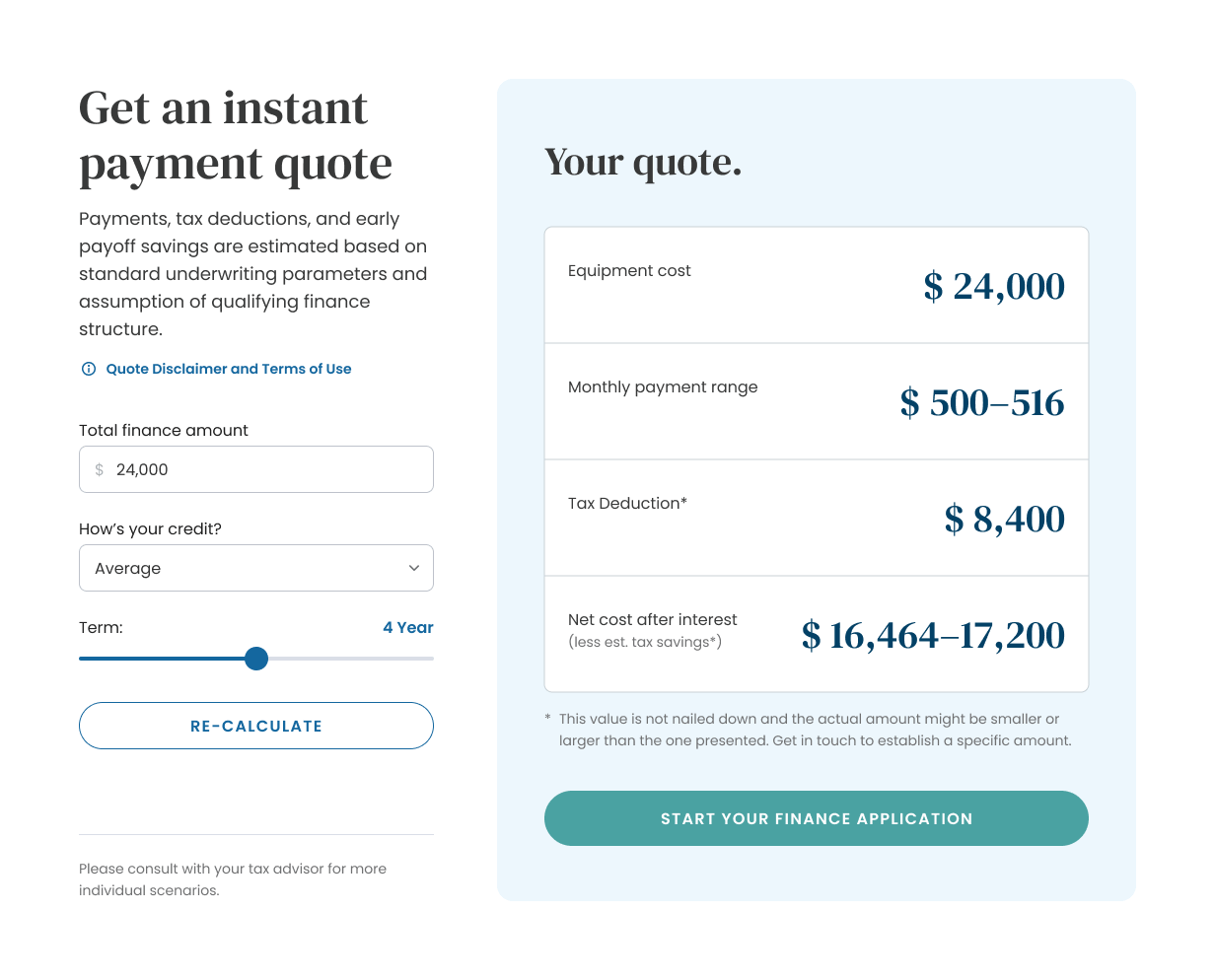
    A finance quote calculator, that precedes the customer form.

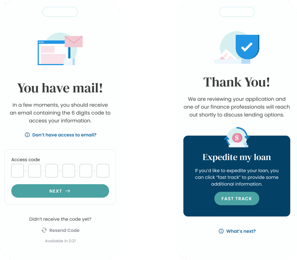
    Mobile versions of the customer form.

    Approach

    I’ve started with understanding the business, talking to key stakeholders to familiarise myself with their ways of working, the challenges they were facing and their goals, constantly bringing the customers into the conversations.

    I’ve mapped out all the journeys and ensured that we’re collecting information that is relevant to the customer in this key point of their financing journey. We’ve looked holistically at the customer financing journey, and we’ve uncovered opportunities to improve the experience even before the actual forms, like the quote calculators and marketing messaging on partner websites.

    After we’ve got to a solid point in terms of visual direction and the overall journey I’ve started documenting and working with development to create a design system that formed the basis of the majority of the customer experiences when interacting with the company.

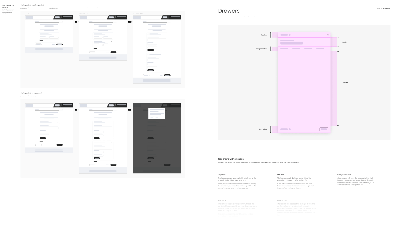
    Experience patterns documentation preview from the design system.

    Outcomes

    We’ve successfully launched around 150 customer forms that saw a ~6.5% completion rate on the generic journey, ~30% on specific journeys.

    Based on that initial work and consistent work throughout our collaboration I’ve also redesigned their website – that showed a ~29.7% average session duration increase and a ~13.4% bounce rate drop.

    We’ve also started working on a suite of products for their internal workflows for the teams involved in the financing process.
    dan.vidrasan@gmail.com

    April 21, 2024
    Case study
    UI/UX DESIGN
  • Designing a multi-market and multi-channel offers and rewards platform

    I’ve designed the experience for a global offers and rewards platform, that ensured that thousands of offers targeted towards bank customers can be consumed and represented in an engaging way.

    Company

    HSBC

    Space

    Fintech

    Period

    2020

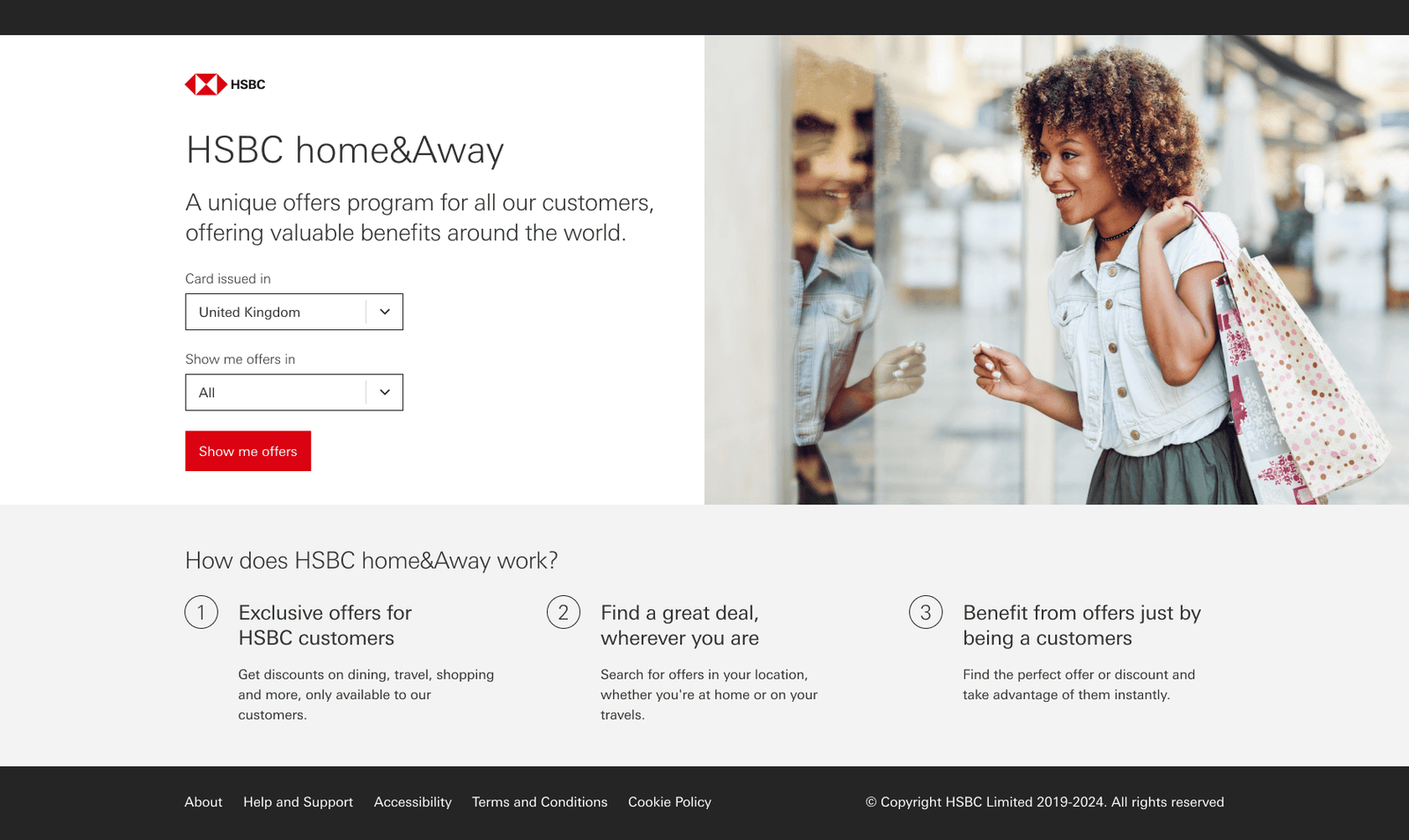
    HSBC Home&Away landing page.

    The objective

    Our primary focus was on establishing a cohesive experience for our customers, consolidating all offers within a single product interface. This addressed the challenge of moving away from the fragmented approach involving more than 30 disparate systems.

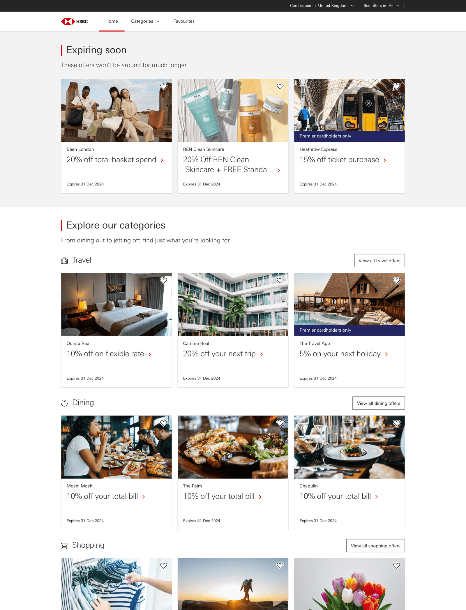
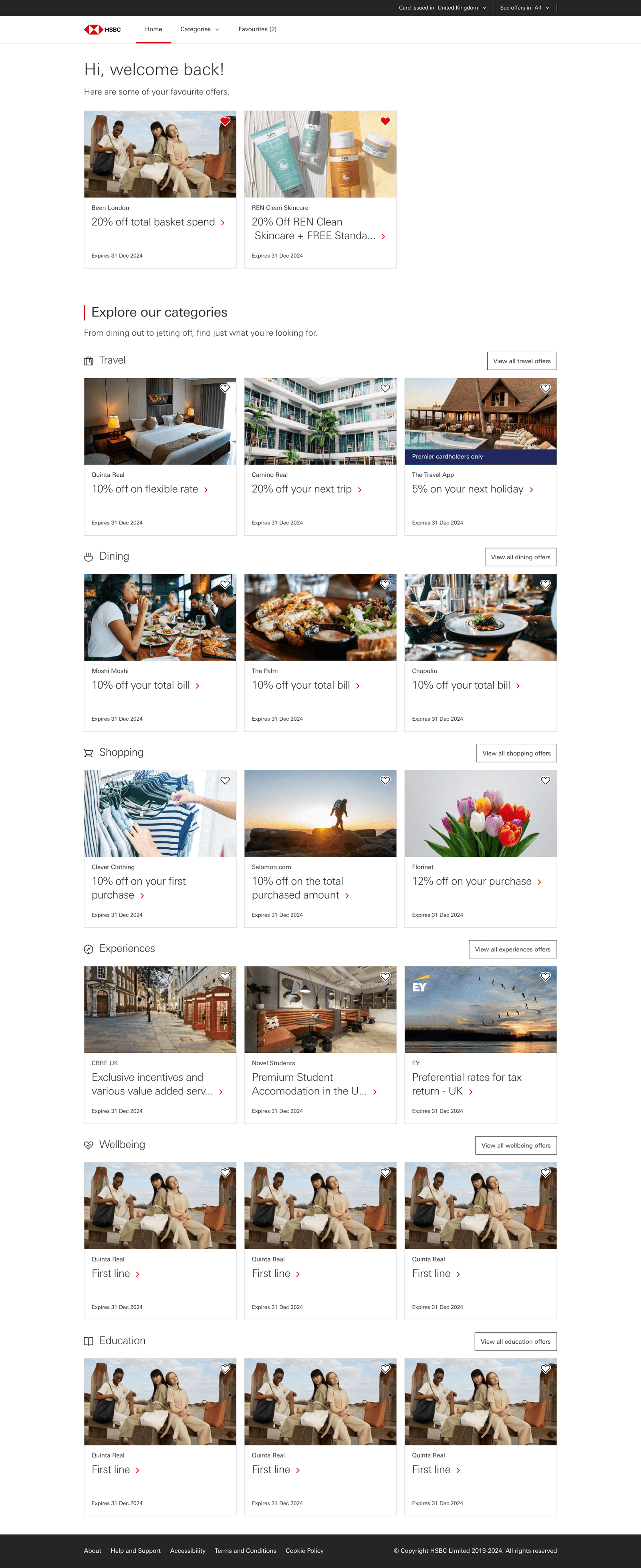
    HSBC Home&Away homepage, featuring offers in various categories.

    HSBC Home&Away landing page.

    HSBC Home&Away homepage, featuring offers in various categories.

    Outcomes

    This product was launched in 3 key markets: Singapore, Hong Kong and the United Kingdom. Additionally, it facilitated the establishment of UK partnerships tailored for specific entertainment experiences.

    dan.vidrasan@gmail.com

    April 21, 2024
    Case study
    Research, UI/UX DESIGN, User testing
  • Bringing all campus operations under one single system

    I’ve designed the CRM that is used by university staff members to manage all the campus operations and also the applicant portal for new and returning applicants, with full transparency of all communications, processes and appointments. I’ve also handled the front-end development for the first year of the project.

    Company

    Verity IQ

    Space

    EdTech

    Period

    2016

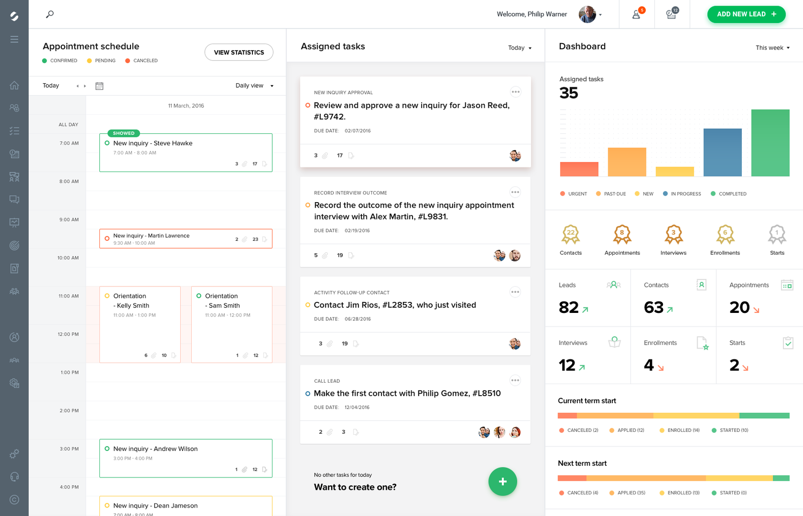
    Preview of the systems home featuring the appointment schedule, assigned tasks and data dashboard.

    objectives

    Managing tasks, keeping track of prospective students, getting in touch with them, handling legal documents and various forms it’s a literal massive pile of paperwork – painful, exhausting and makes onboarding new staff a nightmare.

    Verity was looking to change the archaic ways of managing almost everything in the university environment with a digitalised, all-in-one solution to the mentioned problems.

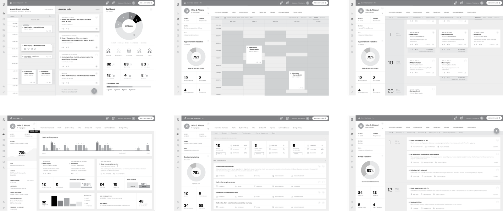
    Initial wireframes for the system featuring: the main dashboard, lead overview, lead calendar, lead agenda and lead communication history.

    Approach

    The founder of the company had massive amounts of experience with educational institutions. The brief and product requirements were fairly detailed, described in depth, and every idea was vetted by actual university staff beforehand. We knew exactly what issues we were solving so we jumped straight in to find the best solutions for them.

    I had to design everything, from the initial interaction with the lead, to defining and customising the communication channels, enrolment forms and legal documents generation.

    Along the way, concepts and prototypes were presented to university staff members and we would get timely feedback that would help us improve the product and create new features.

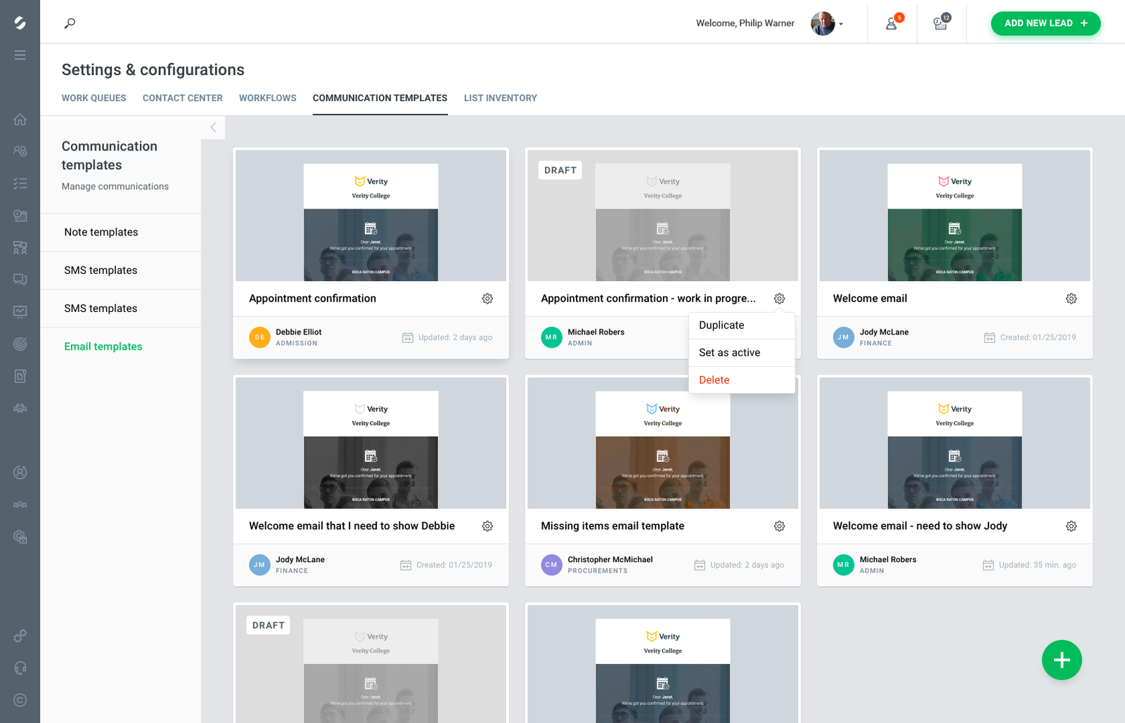
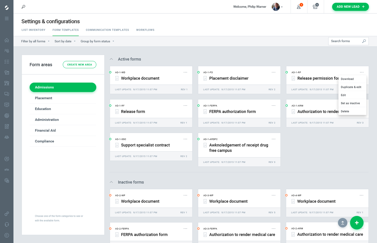
    Preview of the communication templates area.

    Preview of the forms area.

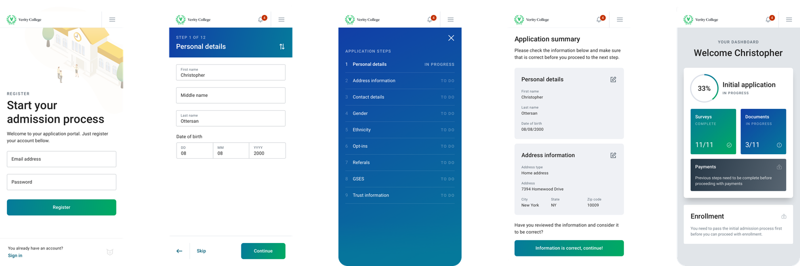
    Screens from the applicant portal featuring account creation and dashboard.

    dan.vidrasan@gmail.com

    April 21, 2024
    Case study
    front-end development, UI/UX DESIGN

Proudly Powered by WordPress